×
awslawandtitle.com
awslawandtitle.com homepage
Web Design Case Study · Real Estate Law · Lutz, Florida

AWS Law
& Title

WordPressElementor ResponsiveLead GenerationPayPal Integration
View Live Site
Client
The Law Offices of Anthony W. Surber, P.A.
Deliverable
Full Website Design & Development
Platform
WordPress + Elementor
Live Site
Page Screenshots
Every page of the delivered site
Click any screenshot to enlarge
The Design Brief

Building trust before the first call

A law firm's website has one job: earn enough trust that a prospective client picks up the phone. For Anthony W. Surber — a sole practitioner with a 20-year career built on personal relationships and deep specialization — the site needed to feel both authoritative and approachable.

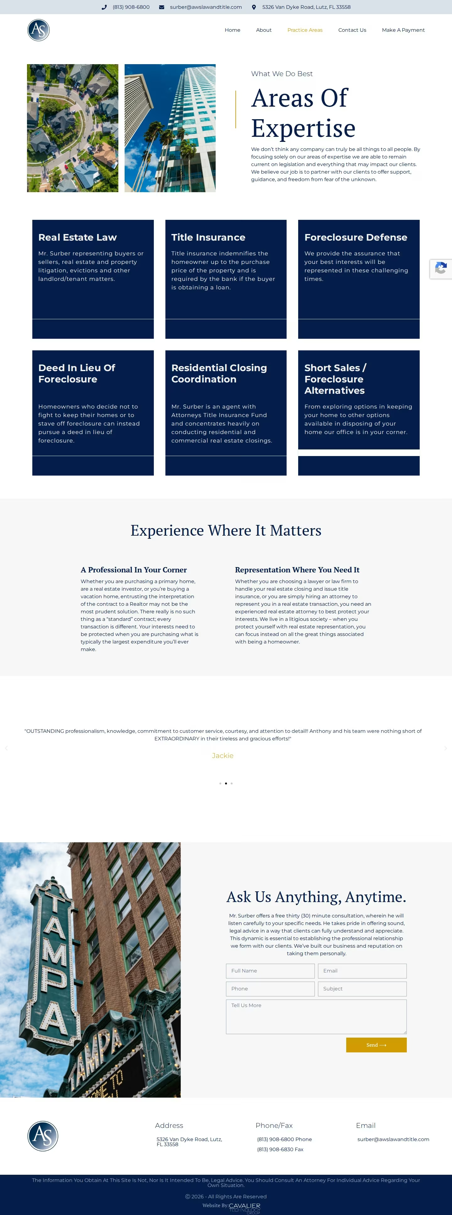
We designed from the outside in: What does a stressed homeowner navigating a foreclosure need to see first? The answers shaped every decision — from the utility bar surfacing the phone number before anything else, to the six-card practice grid communicating scope at a glance without overwhelming.

The result communicates one clear message: this is a focused expert who puts clients first — and you can reach him directly, right now.

Visual Language

Color, type & the look of legal trust

Navy #1B2A4A
White
Off-white
Body text

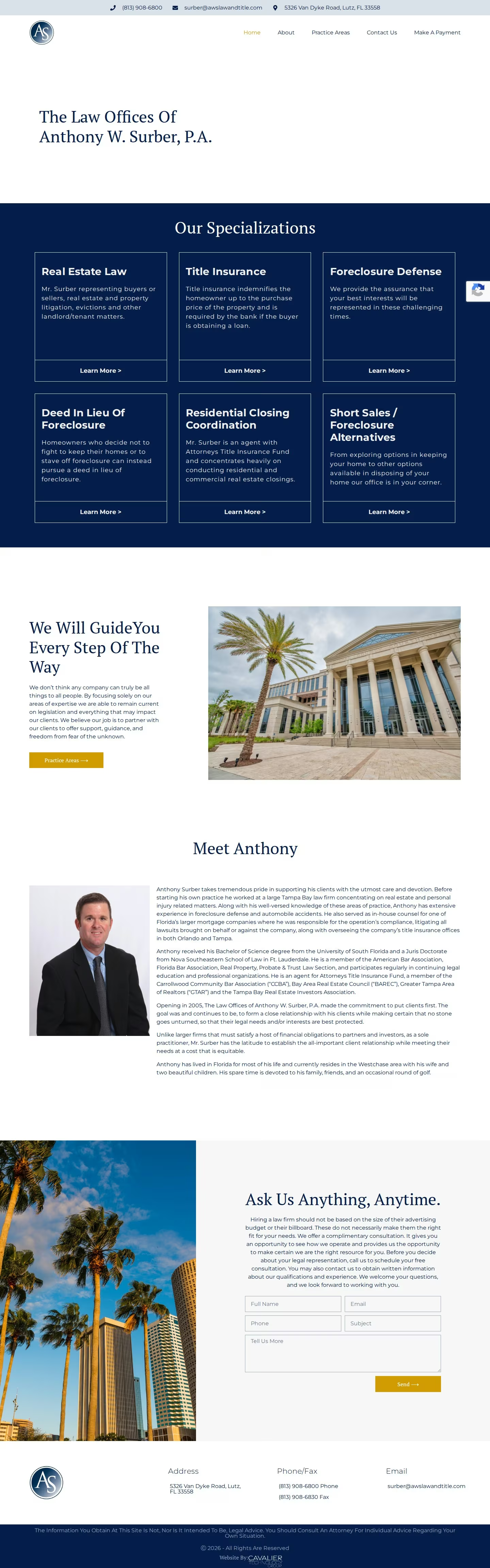
The site's primary color — a deep navy (#1B2A4A) — is one of the most universally trusted hues in professional services. Used across law, finance, and government for its associations with authority and stability, it establishes instant credibility without the coldness of corporate grey.

Against white, the contrast is sharp and legible. Navy service cards with white text create clear visual hierarchy without decorative complexity. The circular "AS" monogram logo signals personal identity over institutional anonymity — this is a person, not a faceless partnership.

Typography pairs a classic serif for display headings with a clean sans-serif for body copy. Established and experienced, but communicates plainly. No legal jargon, no obscure formatting. Exactly what a prospective client needs to feel comfortable picking up the phone.

Design Decisions

Six choices that earn the call

01
Utility Information Bar
Phone, email, and address sit above the logo — visible before any scroll. Clients in stressful situations need contact information immediately. We removed every extra click between "I need help" and "I can reach someone."
02
Sticky Navigation
All five pages remain accessible as the user scrolls. Home, About, Practice Areas, Contact, and Make a Payment are always one click away — no hunting, no back-button friction anywhere on the site.
03
Monogram Brand Mark
The circular "AS" monogram signals personal identity over institutional anonymity. It makes clear this is one expert with one focus — reinforcing the relationship-first positioning on every page of the site.
04
Equal-Weight Service Cards
Six navy cards with uniform visual weight. No service is buried. A visitor researching foreclosure defense and one researching closings both find their answer at the same glance depth — no hierarchy implied.
05
Florida Photography Strategy
Aerial neighborhood shots and Tampa landmarks anchor the firm in local geography. The contact page uses a recognizable Florida historic building — creating geographic trust without stock-photo sterility.
06
Free Consultation CTA
The contact page leads with Anthony's own philosophy before any form — "hiring a law firm should not be based on the size of their advertising budget." Values first, then the ask. Converts by removing the fear of commitment.
Next Project
Riviera RCM